Sellics
Branding, Featured, Icons
Sellics logo exploration and iconography
Sellics - The software platform for Amazon sellers
I was tasked to improve upon, and explore new variants on a logo for Sellics, an all in one software platform for Amazon sellers. Along with the logo there were some main icons that needed a few improvements too.
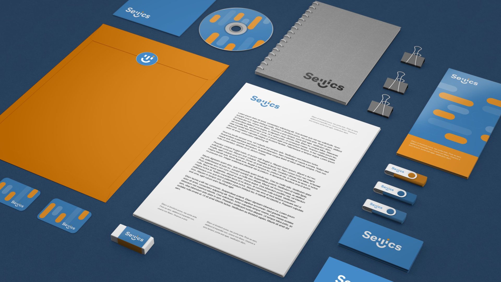
Multiple variants of the logo and some other branding elements were explored, this one was my favorite from the lot altho it didn’t make the cut and the final in use logo was another one. You can check out Sellics here, they are great it you are and Amazon seller.


Icons, Icons & Icons
During the process, we explored some new icons for the main services of Sellics, keeping the old concepts but refining the look to fit with the new logo aesthetics and feel. These are the options for different backgrounds and use instances.
Different colors for each of the services were chosen before the icon re-design.


Icons for service features
For the different landing pages used, as there were many presenting each service in detail, more icons were needed for all features inside each service. These were fast explainer icons in an outline style with multiple accent colors. All services had a unique coloring.


