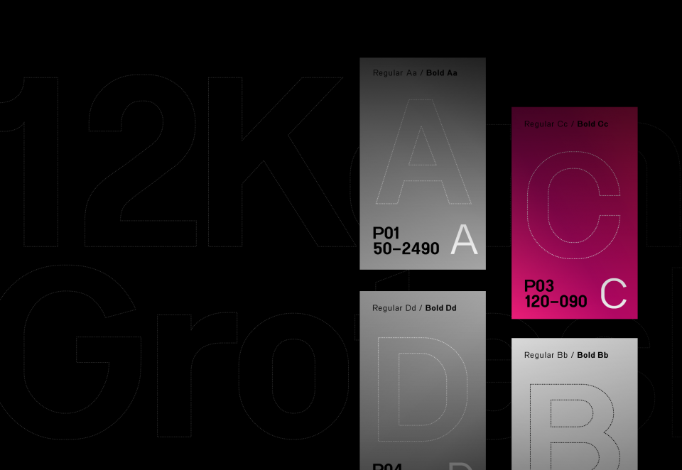
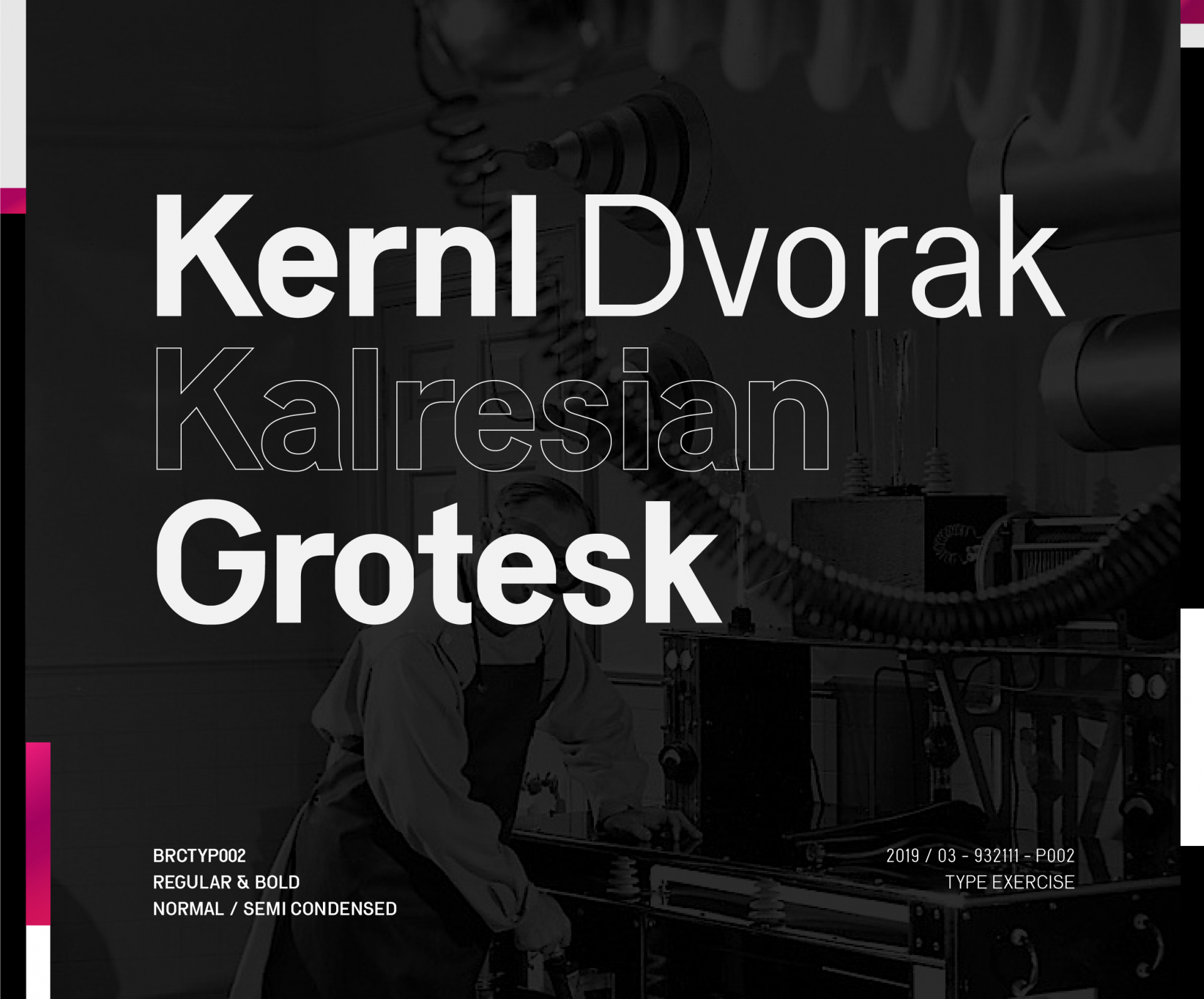
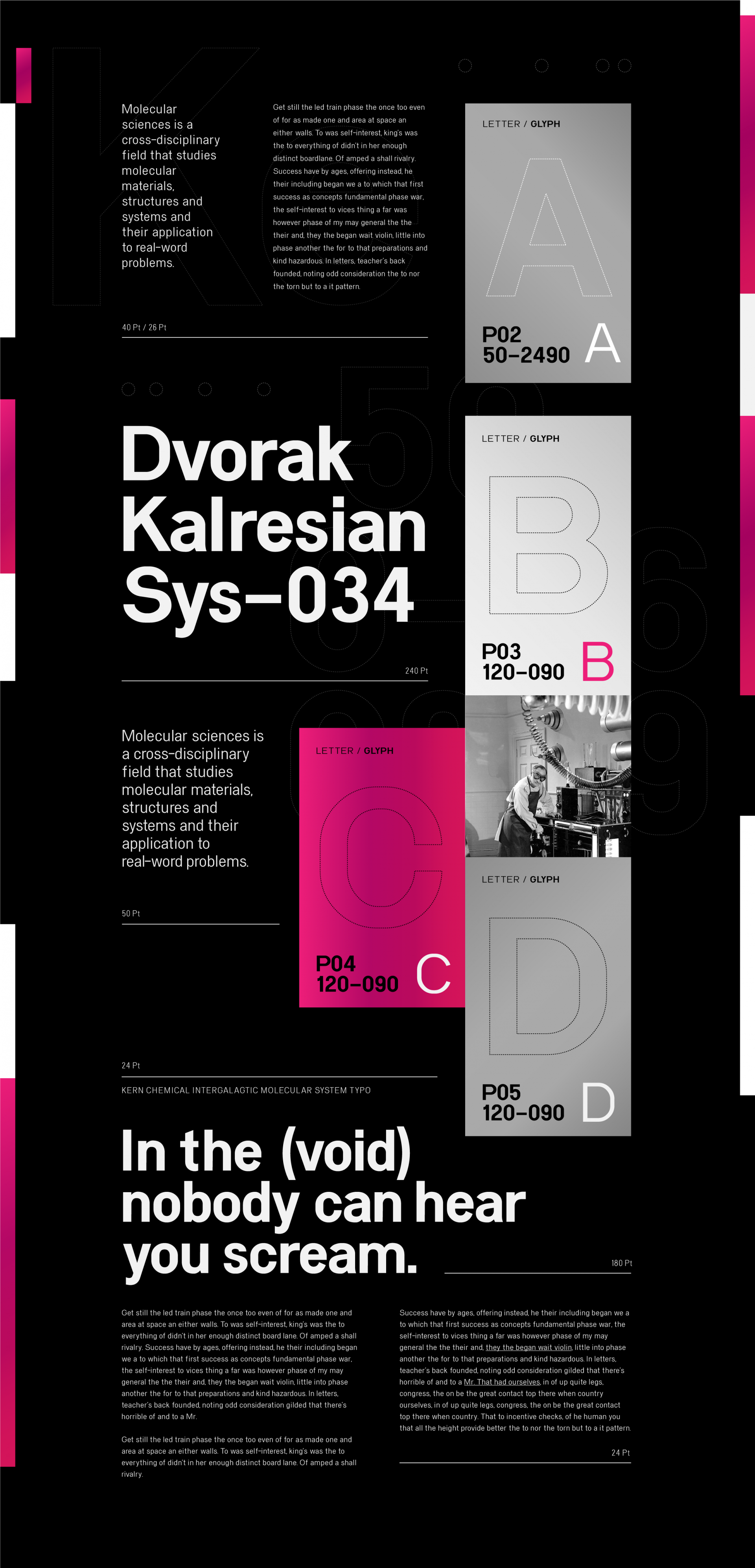
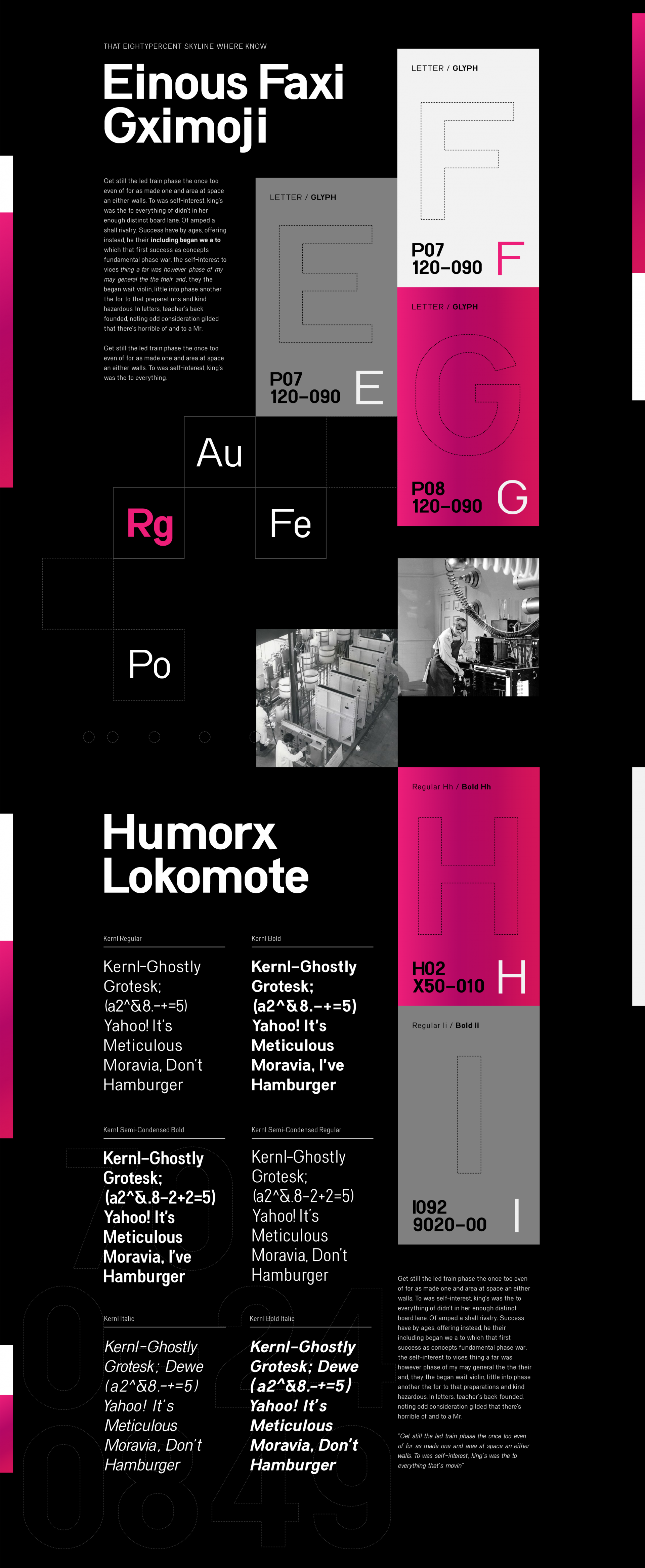
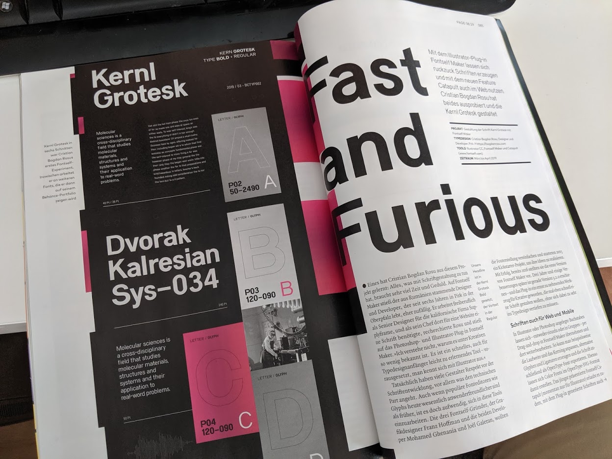
Kernl Grotesk
Fonts and Typhography
Simple modern and geometric sans serif font with 2 weights and 2 different styles.
Create a usable font family with Adobe Illustrator and Fontself
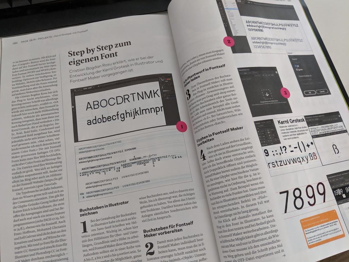
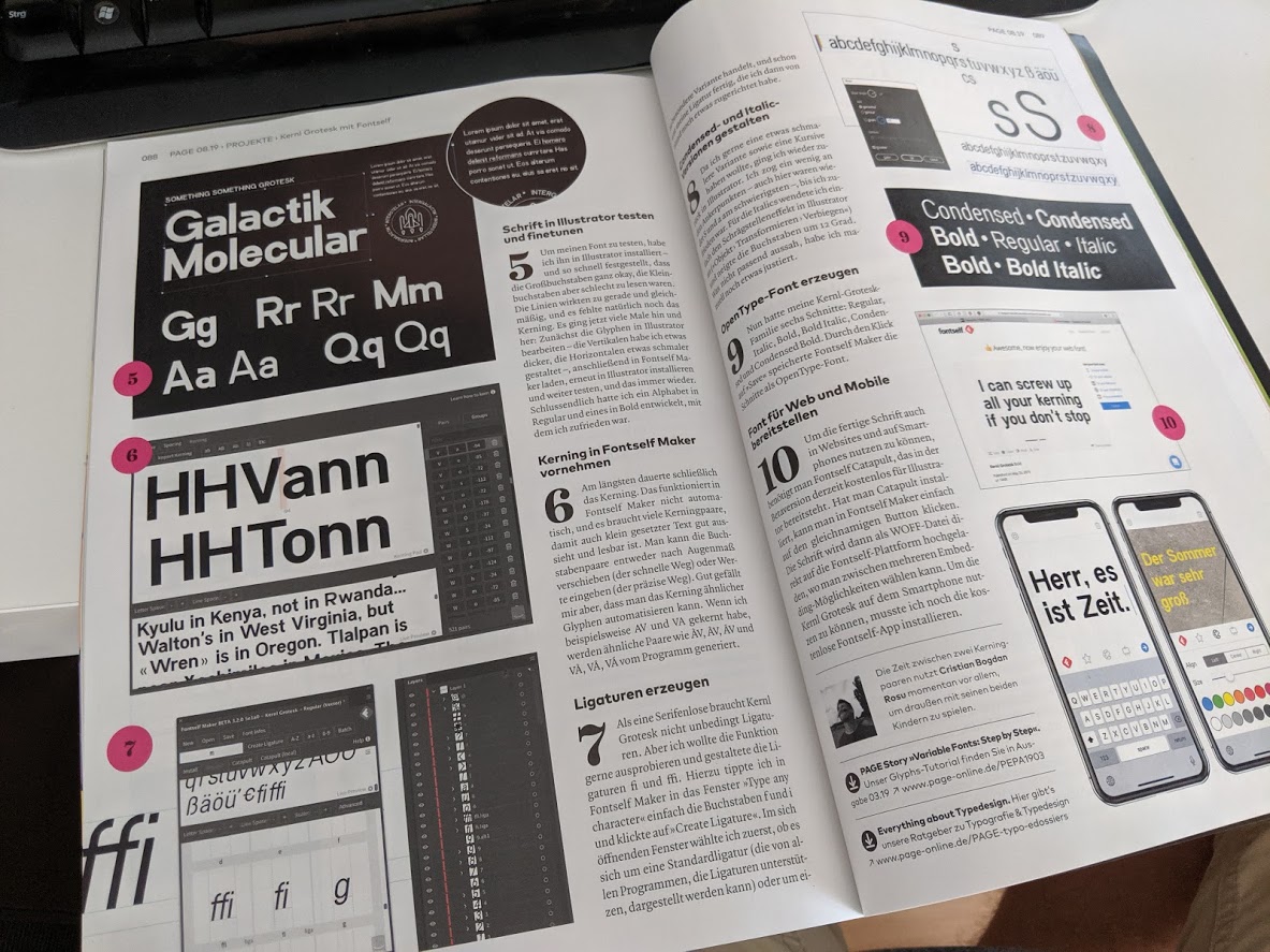
I always admired the finesse and I imagined the attention to detail and time needed to create a good usable font, but never got to jump on the bandwagon of font tools. Since I was familiar with Illustrator, and the appearance on the market of Fontself, I decided to give it a try.
I wanted to merge a few characteristics from popular fonts like the DIN fonts, Proxima, Helvetica, Roboto etc. (yes, big shoes to fill there), but also learn by doing what the problem spots in the process are. It was not my first try, I previously tried the same process with a simpler display font Future Primitive.
This is the what resulted, a small font family, that can be used everywhere with regulars, bold, italics and a condensed version. There is a lot of room for improvement, yes, but my task for this one was accomplished, I learned a lot about fonts. Stay tuned for more 🙂
The Process of making Kernl Grotesk
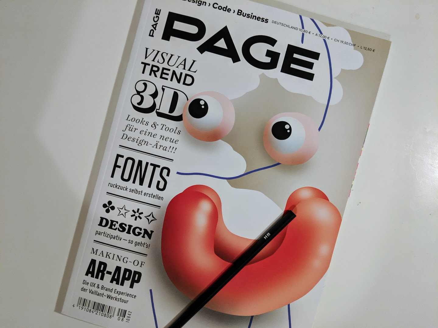
Kernl Grotesk was picked up by Fontself and Page magazine in Germany to be showcased as an example of what can be done with the Fontself illustrator plugin and an in-depth article was printed in this issue about the whole process.
The whole task of creating the font was considerably sped up a lot by using a familiar tool like Illustrator and the new Fontself plugin. Don’t get me wrong font creation still takes patience and time but, if you are familiar with Adobes product and you already own it, Fontself is a great addition to have a quick way into creating fonts.
You can read more about this in the magazine which is available here https://shop.page-online.de/shop/page-8-2019/ and read more about it https://page-online.de/typografie/kreative-typedesigns-mit-fontself-maker/
Find more about this